🍋Fruit 😁Strongly-Agree 📊Project 🟢Conviction 🍽️Community-Mission
Importance: 10%
The Big Idea: The logic and research used to create a church wide color pallet for Our Savior’s Lutheran church and school in Springfield IL.
Much of pop culture color theory and branding practices center around the use of color to build a unique logo or brand identity. While this line of reasoning is not without its usefulness, the colors used within Our Savior’s Church and School should reflect our values of providing safe, and Christ Centered environments within which to learn and grow.
The importance of color is not only based in relevant empirical studies, but is also found in the foundational stories of our faith. Noah receives the full spectrum of rainbow color as a promise of God’s mercy. The tabernacle was constructed with the specific blue, purple and scarlet color scheme placed at important entry points. Revelation pictures the new heavens and new earths as a beautifully colored oasis. Color communicates and stimulates our eyes and even sense of touch.
Therefore, it is fitting to be intentional with the manner in which we treat the built environment of our Church and School. To this end, the following principles have been collected from various academic research to be taken into consideration while determining a new unified color palette for our joint facility.
Principles Drawn from Academic Research
-
The built environment can affect humans in their ability to be motivated, feel emotions, focus, and even retain information.
-
Students range in their ability to screen out distracting environmental factors. For high screeners, distracting colors tend to not be a major factor. However, for low screeners, the presence of distracting environmental elements can deeply damage their ability to learn and focus.
-
The effects of White are generally unclear. Ranging from a greater sense of cleanliness and professionalism to contributing to anxiety, depression, distraction, and greater error rates. Artistically, white is noted as being devoid of emotion and likely to cause frustration.
-
In general, color increases the physical and mental arousal of people inhabiting a space. This is found to be a two edged sword, with too little color creating spaces that are understimulating, while too much color can be distracting or overwhelming.
-
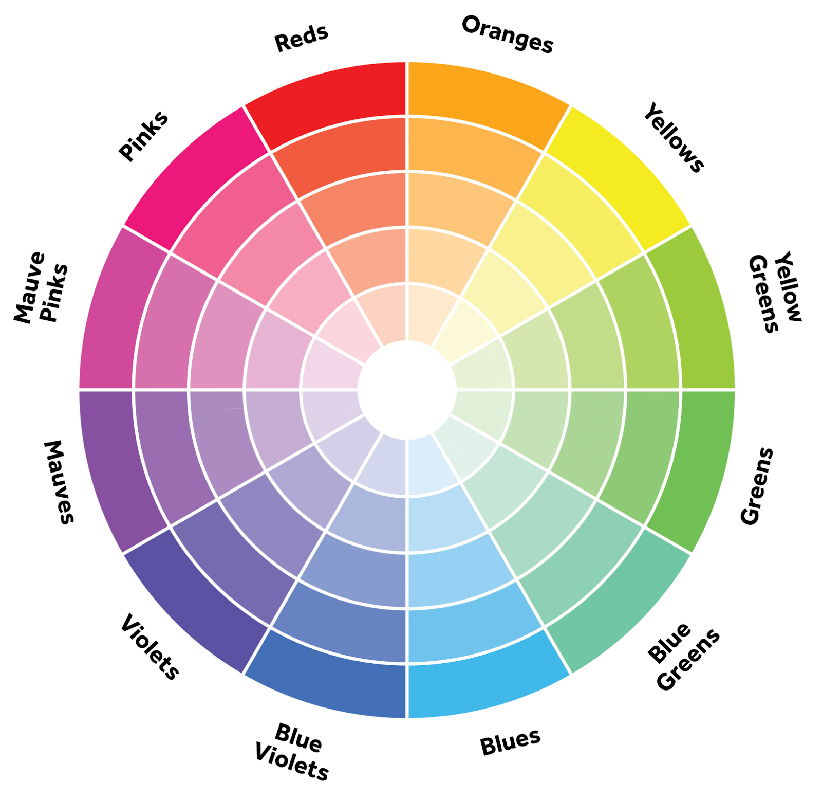
Color can broadly be broken into two categories based on their electromagnetic wavelength. Blue, green and purple are considered in the cool range with short wavelengths. Red, orange and yellow are considered warm with long wavelengths. Blue and Red are at either end of the visible spectrum.
-
Color can be used to create interior landmarks to aid in learning the layout of a facility.
-
The level of light and reflective rating of a particular paint can drastically change the effect of a color. Higher reflective qualities will make a color stand out more and lighten a space, but can also be distracting and straining on the eyes if too reflective. On the other hand, if a color has lower reflective qualities it will fade into the background and make a room feel darker. For safety and accessibility, a reflective difference of 30% is recommended between ceiling, wall, doors, and floor.
-
Culture and personal preferences are still an important factor in the experience of color outside of their base physiological effects.
-
The Incorporation of natural elements and color patterns is important for promoting calm and focus
-
How colors play in different seasons is important. For example, warm colors in the winter can help make a space feel inviting.
-
Off white neutral tones are generally suggested to allow subtle inclusion of color.
-
Bright accent colors should be used sparingly and over small surface areas. Medium accent colors are appropriate for larger feature walls.
-
A basic design principle that helps focus attention upfront while providing enough of a visual break is to paint the main teaching wall with a distinct color and use a neutral color for the remaining three walls.
Color Palette Composition
Online Tools:
- Color palette generator: https://colors.muz.li/
- Shermin Williams colors: Online Colors Picker
- Behr colors: Online Colors
Color Type Definitions:
- Accent. A bright color that is not painted in large areas but can be used as a color pop in art, or other visuals around the room.
- Feature. A medium color that can be used for a feature wall. Meant to bring color and contrast but not be visually overstimulating.
- Neutral. A muted color meant to cover large areas of walls and hallways. Can bring in color undertones but is meant to offer a visual break in the environment.
Goals:
- At least One cool color (short wavelength)
- At least One warm color (long wavelength)
- Neutrals that offer complementary undertones
What Feature and Accent Hues?
Max two of each.
Note
At this stage we only want to pick the main hues to be used within the color scheme. This ensures overall coherence of the pallet.
Feature Hues:
- Blue
- Blue Violets
Neutral/Accent Hues:
- Red
- Orange
What Type of Color Scheme?
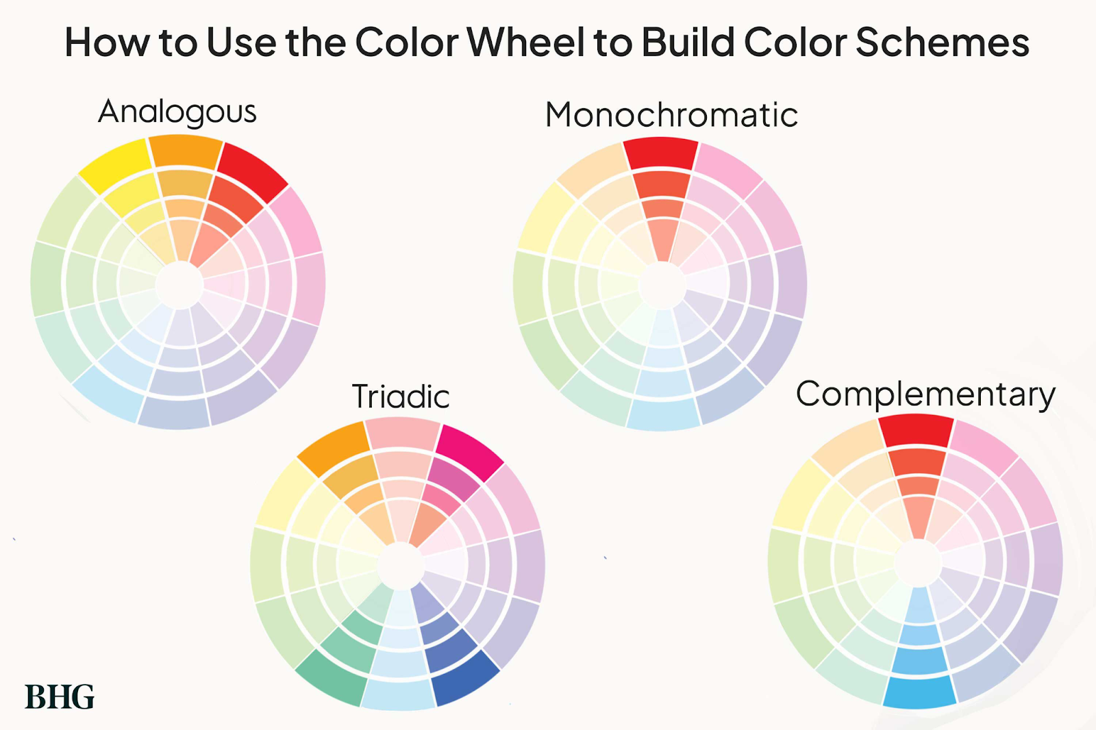
Note
Type:
Analogous Complementary Pairs
Blue
Red
Blue-Violet
Orange
What Neutral Colors?
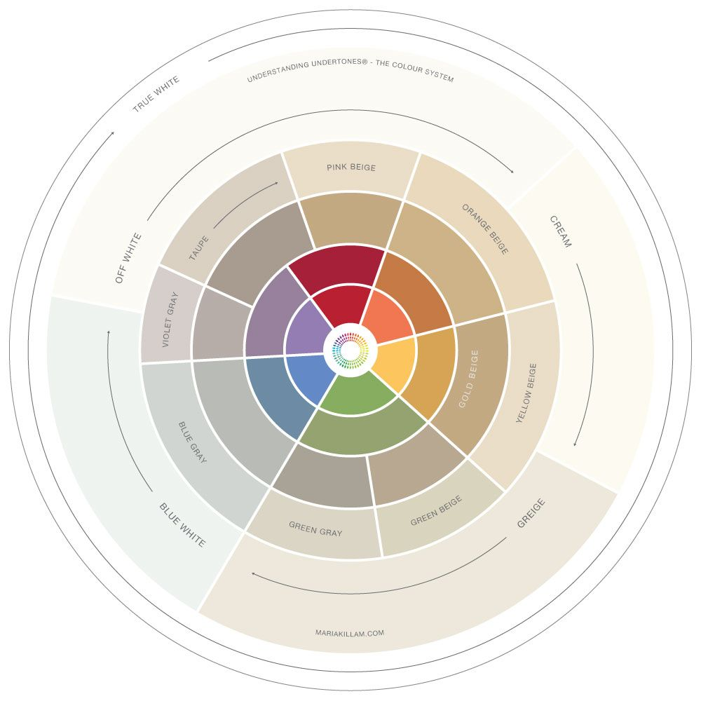
Max three or four.
Note
Neutrals:
- Gray Screen
- Blue family
- Whitetail
- Orange family
- Summer White
- Orange family
Do we have a good balance of Light Reflective Value between each color?
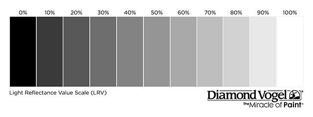
Note
The darkest color on the pallet has an LVR of 15% ranging up to 86% with the brightest. This will provide a good contrast between feature wall colors and neutral walls. With the smallest contrast being 17% but the average being 41%.
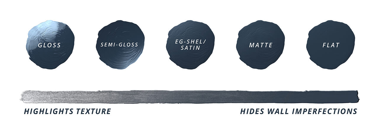
Do we have sane guidelines for paint finish?
Note
Satin is the preferred classroom wall finish for neutral walls for the sake of easy cleaning. Eggshell is preferred for hallways because of its durability.
Full Color Palette
| Name and Sherwin Williams # | Swatch | Type | RGB Values (0-255 range) | Hex Value | LVR Value | Finish Type | Color Family |
|---|---|---|---|---|---|---|---|
| Down Pour SW 6516 | Feature | R:67 G:113 B:139 | 43718b | 15% | Satin |  | |
| Regale Blue SW 6801 | Feature | R: 125 G: 181 B: 211 | 7DB5D3 | 42% | Satin |  | |
| Gray Screen SW 7071 | Neutral | R: 198 G: 202 B: 202 | C6CACA | 59% | Satin for Walls Eggshell for Hallways | 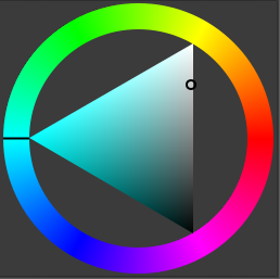 | |
| Whitetail SW 7103 | Neutral | R: 244 G: 239 B: 228 | F4EFE4 | 86% | Satin for Walls < Eggshell for Hallways | 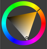 | |
| Summer White SW 7557 | Neutral | R:244 G: 233 B: 214 | F4E9D6 | 83% | Satin for Walls Eggshell for Hallways | 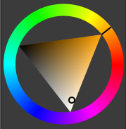 |